Built around one action
A single decision on the page. No navigation, no secondary offers, nothing that gives a visitor a reason to wander off.
Studio navigation
Service 06 — Landing Pages
Single-purpose pages for a campaign, launch or ad spend. One action per page, and no navigation pulling people away from it.
The work itself
The discipline is subtraction. That is most of the work.
A landing page has one job: take the person who clicked your ad, email or link, and make the next step feel obvious. Everything that does not serve that job is removed — including the navigation, the other offers, and the paragraphs that exist because someone felt the page looked empty.
So the work is deciding the single action, matching the page to whatever the person just clicked, and then removing everything else. The form is wired up and tested end to end before launch, because a page that captures nothing is worse than no page.
What we cannot do is make a weak offer convert. If the offer is the problem, no layout fixes it, and we will say so before you spend on traffic.
How we work on it
Short project, tight scope, no long onboarding.
What single action this page exists to produce. Everything else on the page is then judged against that.
The page has to continue whatever the ad, email or post promised. A mismatch there loses people in the first two seconds.
Headline, proof, and one call to action repeated where it makes sense — nothing competing with it.
The form is submitted end to end and notifications confirmed before launch, not after.
Tracking in place so you can judge the page against real numbers rather than impressions of it.
What's included
Six things, and deliberately not a seventh.
A single decision on the page. No navigation, no secondary offers, nothing that gives a visitor a reason to wander off.
The first line decides whether people stay. It speaks to what they were promised, not to what you would like to say about the company.
Written around why someone should act, in plain language, without filler paragraphs added to make the page feel substantial.
Strong, obvious and repeated where it makes sense. Visitors are never left working out what to do next.
Most campaign traffic arrives on a phone. A slow or awkward page loses people before they reach the offer.
A short form, notifications confirmed, and the whole path tested before a single visitor sees it.
Running ads to a page that is not converting?
Send us the page and the ad — often the mismatch is the problemRelated work
Campaign pages are usually private to a client, so these are broader builds. Ask us about any of them.
01
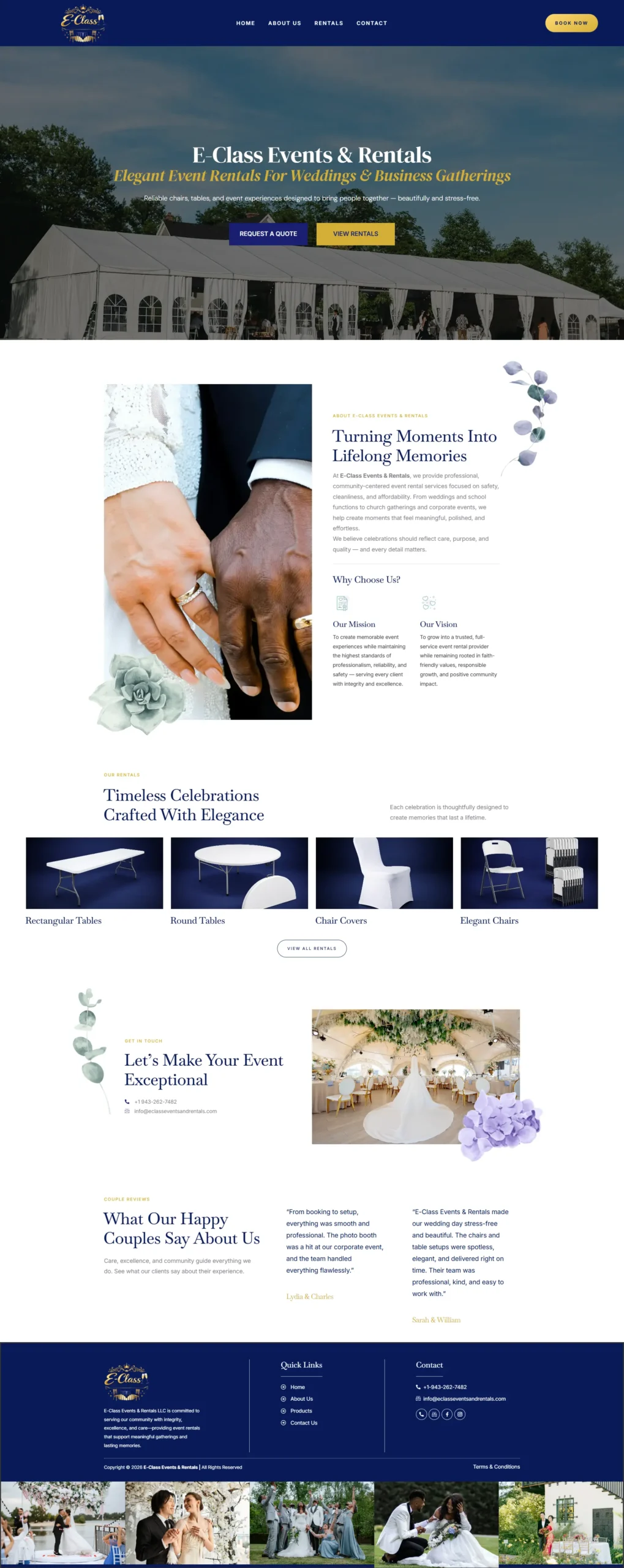
Travel & Events
An event and rental platform with a catalogue and a booking flow that holds up on a phone.
02
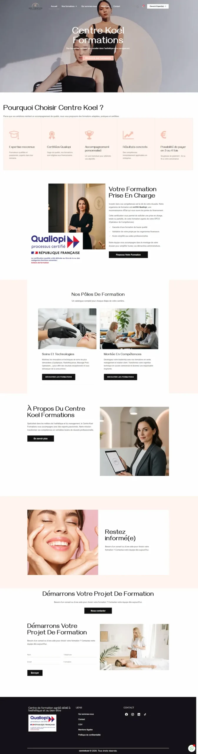
Education & Training
A course platform structured so each programme explains itself and enrolling is a short path.
Fit
Landing pages are oversold. Here is when not to buy one.
This is a good fit if
This is not the right fit if
Questions
A normal page serves several purposes and links onward. A landing page serves one and deliberately removes the exits, including the navigation.
Yes. Copy is most of what makes a landing page work, so it is part of the job rather than something handed back to you to fill in.
It uses your brand, but it is built for the campaign rather than the site. Sometimes that means it deliberately looks simpler.
No. We can make the action obvious, the page fast and the capture reliable. What converts also depends on your offer and the traffic you send.
No. We build the page and make sure it is measurable. Campaign management is not a service we offer.
Much shorter than a site build. Once the goal and the offer are agreed, it is a focused piece of work — we will give you a date up front.
Start a landing page
Tell us the campaign and the one action the page has to produce. You will get a straight answer on what we would build and what it costs.
No pitch deck. If we're not the right studio for it, we'll say so.